Saturday, February 3, 2024

On Using AutoML for NYC Taxi Trip Duration Prediction

While explaining Optuna to a client in the context of hyperparameter tuning, and performing more research on the topic, I came across AutoGluon to perform "AutoML for images, text, and tabular data". After a quick scan of the documentation, I decided to give it a try and see how it performs on a simple project.

I always loved the Kaggle competition NYC Taxi Trip Duration, as the data has spatial, temporal, and other traditional attribute information and is a great dataset to test various models and feature engineering techniques.

I used a local Apache Spark instance (as it is my go-to ETL engine) to perform some feature engineering before letting AutoGluon do its magic. As a quick proof of concept, the results are quite impressive, and here are the steps to reproduce the project and visualize the result.

Sunday, January 28, 2024

Arabic SDK For Apache Spark

I recently attended the Esri Saudi Arabia User Conference and was amazed by the changes in the Kingdom. The capital city of Riyadh is booming and proliferating. During the conference, I presented on integrating GenerativeAI and GIS in the plenary session and led a session on BigData and GeoAnalytics Engine. GeoAnalytics Engine, based on Apache Spark, allows spatial operations on Spark data frames. We showcased a project called "A Day in the Life," which used historical traffic data from HERE to demonstrate traffic congestion during peak hours. Traffic is notoriously bad in the city, so this was a fitting example. My colleague Mahmoud H. presented a traditional workflow process in a Jupyter Notebook off a Google Cloud DataProc cluster, efficiently processing over 300 million records (this is relatively "small"). The processed traffic information was then displayed in ArcGIS Pro in a time-aware layer to reflect the congestion visually while activating a time slider. At the end of the presentation, we surprised the audience by using ChatGPT to translate Arabic sentences to SparkSQL code, and Azure OpenAI GPT4 handled the translation very well. Look here for code snippets. This form of interaction IS the future, and I am excited to invest more in this technology and in the following areas:

  1. Enhanced Visualization and Real-time Data Integration:
    • Dynamic Visualization: Integrating real-time traffic data feeds into existing models. This will not only show historical congestion but also provide live updates. Dynamic heatmaps can be particularly effective in visualizing the intensity of traffic at different times.
    • 3D Modeling: Utilize ArcGIS's 3D scene capabilities to give a more immersive view of traffic congestion and urban planning scenarios.
  1. Improved Data Analysis through Machine Learning:
    • Predictive Analytics: Integrate machine learning models to predict future traffic patterns based on historical data, weather conditions, events, and other variables.
    • Anomaly Detection: Implement anomaly detection algorithms to identify unusual traffic patterns, which can be crucial for incident response and urban planning.
  1. Enhancing User Interaction and Accessibility:
    • Multilingual Support: While we showcased the translation of Arabic sentences to SparkSQL code, we should consider expanding this feature to include more languages, making your tool more accessible to a global audience.
    • Voice Commands and Chatbots: Integrate voice command functionality and develop a chatbot using Azure OpenAI GPT4 for querying and controlling the GeoAnalytics Engine, making the system more interactive and user-friendly.
  1. Scalability and Performance Optimization:
    • Optimization for Large Datasets: Continue to refine the efficiency of processing large datasets. Explore the latest advancements in distributed computing and in-memory processing to handle even larger datasets more efficiently.
    • Cloud Integration: Ensure the solutions are cloud-agnostic and can be deployed on any public or private cloud provider, enhancing the system's scalability and reliability.
  1. Collaboration and Sharing:
    • Collaborative Features: Develop features that allow multiple users to work on the same project simultaneously, including version control and change tracking for shared projects.
    • Export and Sharing Options: Enhance the ability to export results and visualizations in various formats and share them across different platforms, facilitating easier collaboration and reporting.
  1. Ethical Considerations and Transparency:
    • Data Privacy: Address data privacy concerns by implementing robust data encryption and anonymization techniques, ensuring that individual privacy is respected while analyzing traffic patterns.
    • Algorithm Transparency: Provide clear documentation and explanations of the algorithms used, promoting transparency and trust in your system.

Saturday, January 27, 2024

Back in Action: GenAI Meets GeoSpatial

 Hello, everyone. It has been a while since my last post, and I wanted to explain my absence. I have been working on demanding client projects requiring confidentiality, so I couldn't share anything.

But now I'm back and excited to dive into something new and exciting. 

Generative AI (GenAI) has gained much attention lately, but I'm taking it to a different level by merging Large Language Models (LLMs) with insights from geospatial analysis. It's GenAI with a GeoSpatial twist.

I want to introduce a simple project, "ReAct geospatial logic with Ollama," which uses resources such as the Python Langchain and Ollama.

I'm thrilled to be back and can't wait to start this new journey with you. Keep an eye on this space for future updates, tips, and unique code snippets. Your feedback and questions are valuable, so please don't hesitate to reach out.

I'll see you in the next post, and as usual, you can check out the source code here.

Monday, August 24, 2020

On Machine Learning in ArcGIS and Data Preparation using Spark

Artificial Intelligence / Machine Learning implementations have been part of Esri software in ArcGIS for a very long time. Geographic Weighted Regression (GWR) and Hot Spot Analysis are Machine Learning algorithms. ArcGIS users have been utilizing supervised and unsupervised learning like clustering to solve a myriad of problems and gain geospatial insight from their data.  We just did not call these learning algorithms AI/ML back then.  Not until the recent popularity of DeepLearning that finally blossomed from the AI Winter and made AI a household name. And guess what? Esri software has now DeepLearning implementations!

It is important to understand the difference between AI, ML, and DL.  I came across this very insightful article that analogizes the relationship to Russian dolls.

Typically, collected data is very "dirty", and a lot of cleaning has to performed on it before processing it through a Machine Learning algorithm.  The bigger the data, the harder is the process especially when pruning noisy outliers and anomalies.  But then, that could be what you are looking for, outliers and anomalies. That is why "Data Janitor" is a new job title, as a majority of your time when dealing with data is cleaning it!  That is why I love to use Apache Spark for this task. It can handle BigData very efficiently in a distributed, parallel share-nothing environment, and the usage of the DataFrame API and SQL makes the maniplation a breeze. Utilizing the latter two in an interactive environment like a Jupyter Notebook enables quick cleaning and more importantly insightful explorations.

Now the best part, we can have all 3, Jupyter, Spark and ML, in one enviroment; ArcGIS Pro!

This notebook and that notebook demonstrate the usage of Spark in Notebook in Pro to clean and explore the data, and then prepare it for Machine Learning.  We are using the built-in Forest Based Regression to predict (or attempt to predict) the trip duration of a New York City taxi given a pickup and dropoff location.
The last notebook, enables the user to select pickup locations (in the below case, about JFK) and "see" the errors of the model on a map.

Some will argue that all this could have been done using Pandas, and that is true. But that is not the point of this demonstration and this assumes that all the data could be held in memory which is true in this case (1.45) but will fail when you have 100's of million of rows and you have to process all this data on one machine with limited resources.  If you like Pandas, I recommend that you check out Koalas.

Monday, August 3, 2020

ArcGIS Pro, Jupyter Notebook and Databricks

Yet another post in the continuing saga of the usage of Apache Spark from a Jupyter notebook within ArcGIS Pro.

In the previous posts, the execution was always within the ArcGIS Pro environment on a single machine, albeit taking advantage of all the cores of that machine.  Here, we take a different angle, the execution is performed on a remote cluster of machines in the cloud.

So, we author the notebook locally, but we execute it remotely.

In this notebook, we demonstrate the spatial binning of AIS broadcast points on a Databricks cluster on Azure. In addition, to colocate the data storage with the execution engine for performance purposes, we converted the local feature class of the AIS broadcast points to a parquet file and placed it in the Databricks distributed file system.

More to come :-)

Sunday, August 2, 2020

Virtual Gate Crossing

Yet another continuation post regarding Pro, Notebook, and Spark :-). In this notebook, we will demonstrate a parallel, distributed, share-nothing spatial join between a relatively large dataset and a small dataset.

In this case, virtual gates are defined at various locations in a port, and the outcome is an account of the number of crossings of these gates by ships using their AIS target positions.

Note that the join is to a "small" spatial dataset that we can:

  • Broadcast to all the spark workers.
  • Brutly traverse it on each worker, as it is cheaper and faster to do so that spatially index it.

The following are sample gates:


And the following is a sample processed output:

More to come...

Saturday, August 1, 2020

MicroPath Reconstruction of AIS Broadcast Points

This is a continuation of the last post regarding ArcGIS Pro, Jupyter Notebook, and Spark. And, this is a rehash of an older post in a more "modern" way.

Micropathing is the construction of a target's path from a limited set of a consecutive sequence of target points. Typically, the sequence is time-based, and the collection is limited to 2 or 3 target points.  The following is an illustration of 2 micropaths derived from 3 target points:


Micropathing is different than path reconstruction, in such that the latter produced one polyline for the path of a target. Path reconstruction losses insightful in-path behavior, as a large number of attributes cannot be associated with the path parts. Some can argue that the points along the path can be enriched with these attributes. However, with the current implementations of Point objects, we are limited to only the extra M and Z to the necessary X and Y. You can also join the PathID and M to a lookup table and gain back that insight, but that joining is typically expensive and is difficult to derive from it the "expression" of the path using traditional mapping. A micropath overcomes today's limitations with today's traditional means to express the path insight better.


So, a micropath is a line composed of typically 2 points only and is associated with a set of attributes that describe that line.  These attributes are typical enrichment metrics derived from its two ends. An attribute can be, for example, the traveled distance, time, or speed.


In this notebook, we will construct "clean" micropaths using SparkSQL.  What do I mean by clean? As we all know, emitted target points are notoriously affected by noise, so using SparkSQL, we will eliminate that noise during the micropath construction.


Here is a result:

More to come...

Friday, July 31, 2020

On ArcGIS Pro, Jupyter Notebook and Apache Spark

Been a while since I posted something, and thank you, faithful reader, for coming back :-)

I'm intending to writing a series of posts on how to use Apache Spark and Machine Learning within a jupyter notebook within ArcGIS Pro.  Yes, you can now start a jupyter notebook instance in ArcGIS Pro to create an amazing data science and data exploration experience. Check out this link to see how to get started with a Jupyter notebook in Pro.  But...my favorite hidden "GeoGem", is that Pro comes with built-in Apache Spark, and y'all know how much I love Spark. People think that Spark is intended for only BigData analytics.  That is so far from the truth. What I love about it, is the frictionless movement of data and analysis locally or remotely and the language fusion.  In my case, I'm using Python, SQL, and Scala.

The usage of Apache Spark in Pro was demonstrated in the publically shared Covid-19 Contact Tracing Application and the Proximity Tracing Application.

In this first notebook, we will start by loading selected features into a Spark dataframe from a local feature class, process the dataframe using Spark SQL, and write the result back to an ephemeral feature class that will be displayed on the map.


Like usual, all the source code can be found here.

Sunday, May 27, 2018

On Patterns Of Life: From MacroData to PicoData

Insight (or GeoInsight in our case) is lost in the deluge of data that we are acquiring today from everyday sensors that are machine or humanly generated. This project is a set of heuristic Spark based implementations to reveal signals from the movement of ships in and out of the Port of Miami.

The idea is to extract small clean data (PicoData) from the overlap of a massive amount of data (MacroData). The aggregation of "clean" PicoData derived from MacroData trust into the forefront patterns of life.

For example, given the following display of AIS broadcasts:

img-alternative-text

We can mutate the data to reveal the "clean" influx of ships into the harbor at high tide:

img-alternative-text

Like usual, you can download all the source code from here.

Monday, January 1, 2018

On ML and Elastic Principle Graphs

Happy 2018 all. It has been a while since my last post. Thank you for your patience dear reader. Like usual, the perpetual resolutions for every year in addition to blogging more are to eat well, often exercise and climb Ventoux.

Onward.

I genuinely believe that 2018 will be the year of the ubiquity of Geo-AI. It will be the year when Machine Learning and Spatial Awareness will blossom inside and mostly outside the GIS community.

We at Esri have had Machine Learning based tools in our "shed" for a long time. Every time an ArcGIS user performs a graphically weighted regression, trains a random trees classifier or detects an emerging hot spot, that user is using a form of Machine Learning without knowing it!

So one of my "missions" for 2018, it to make this knowledge more explicit to our users and non-traditional GIS users. Also, start to implement new forms of Machine Learning.

Machine Learning (ML), a branch of Artificial Intelligence (AI), is a disruptive force that is changing how today's industries are gaining new insight from their data. ML uses math, statistics and probability to find hidden patterns and make predictions from the data without being explicitly programmed. It is this last statement that is disruptive, "No explicit programming"! An ML algorithm iterates "intelligently" over the data, and the patterns emerge. Being iterative, the more data an ML algorithm is exposed to, the more refined the output becomes. Thus the coupling of BigData and ML is a perfect marriage fueled by cheap storage, ever more powerful computational power (think GPU) and faster networking.

This reemergence of this "No Explicit Programming" paradigm such as Deep Learning, Reinforcement Learning, and Self Organization is skyrocketing the likes of Google's AlphaGo-Zero, Facebook, and Uber.

So, I am starting this launch with something I have been fascinated by for quite some time, and that is "Elastic Principle Graphs."

It is a "deep" extension of PCA that I came across it during my research of mapping noisy 2D data to a curve and was fascinated by its self-organization.

img-alternative-text

After reading, (and rereading for the nth time) this paper, this GitHub repo is a minimalist implementation in Scala.

Happy New Year All.

Sunday, April 16, 2017

On Machine Learning and General Path Recognition

This is part II of my journey back into SOMs. Actually this journey started with the below picture:

Map

It is a map of AIS broadcast points around the harbor of Miami, FL. Now we, sentient creatures, when we look at this map we can quickly and clearly see patterns formed by the points. There is a sequence of points that start from the harbor and go northeast.  There is a sequence of points that starts at the harbor and go south southeast. And there are a plenty of north south paths, some are very close to the shore, others are on the "edge" to the east. And there are path in the "middle".

Wouldn't it be wonderful if the Machine can see these pattern and formulate the general paths? That is actually what started this journey. I needed an unsupervised way for the Machine to recognize the patterns and emit the paths. I'm sure there are multiple ways to solve this, but I remembered that a while back I used Self Organizing Maps due to their simplicity and crucially for belonging to a class of unsupervised machine learning algorithms. So, in Part I, I reacquainted myself with SOMs and in this part, I completed the journey by showing the paths.

However faithful reader, I have not been totally honest with you. Please forgive me. This is part III in this journey. Along the way, I diverted a bit, as I needed a way to assemble tracks from targets. There exist a hidden gem in this project. The PathFinder application is an important stop on this journey, as in addition to assembling tracks from targets, it quantizes the path into grid cells. The quantization of paths is the linchpin between the raw targets points and the unsupervised path detection.

The below picture will help in my explanation:

Track

If a virtual grid is overlaid on the map (the grid cells in the above map are coarse on purpose for illustration purposes), then a linear vector that represents a path can be composes by scanning the grid cells from left to right and then from top to bottom.  The existence of targets in a cell is the binary value of the element in the vector.  So in the above case, the path will be represented by the vector [0,0,0,0,1,0,0,0,1,1,1,1,0,0,0,1]. Side note: In this implementation the vector is composed of binary values, however, a vector with real numbers can be composed where the element value is proportional to the number of targets. In addition, the cell values can "bleed" to neighboring cells in say a gaussian way for better path recognition. Will have to come back to this one day. A Master's thesis can be made out this.

Now that we can compose a set of vectors from a set of targets, we can train the SOM with these vectors. The below figure is the visual representation of a 3x3 SOM result. Each sub map is a visual representation of the settled weights of a SOM node where each node weight is a linear representation of a quantized grid as described above.

Fig2

We can see the path patterns that have self organized, and they do reflect what we have implicitly seen in the first map as humans. I highlighted in red the cells in each map with the most target associations thus forming a path. Isn't it amazing ?

Like usual, you can download all the source code for this from here.

Sunday, April 2, 2017

On Machine Learning with Self Organizing Maps

Self Organizing Map (SOM) is a form of Artificial Neural Network (ANN) belonging to a class of Machine Learning. AI Junkie has a GREAT tutorial about it. What I like about SOMs is that they belong to a class of unsupervised learning models and they hold true to the first law of geography.

"Everything is related to everything else, but near things are more related than distant things." - Tobler

I encountered them and used them over 20 years ago, and since AI/ML is the hottest topic these days, I'm reacquainting myself with them. There are plenty of SOM libraries, but I learn (or in this case re-learn) by doing.  This project is my learning journey in implementing SOMs and "Sparkyfing" them.

The following is a sample output of the obligatory RGB classifier, where a million random RGB triples are organized by a Spark based SOM into a 10x10 square lattice:

Som2

And the following is a sample solution to a TSP using SOM:

Tsp

Like usual, all the source code can be found here.

Monday, March 27, 2017

ArcGIS, Spark and Alluxio Integration

There exist a plethora of backend distributed data stores. I am always using S3 or Hadoop HDFS or OpenStack Swift with my GIS applications to read from these backends geospatial data or to save into these backends my data. Some of these distributed data stores are not natively supported by the ArcGIS platform. However, the platform can be extended with ArcPy to handle these situations. Depending on the data store, I will have to use a different API (mostly Python based) to read and write geospatial information. This is where Alluxio comes in very handy. It provides an abstract layer between the application and the data store and (here is the best part), it caches this information in memory in a distributed and resilient-to-failure manner. So, at the application level, the code to access the data is invariant. On the backend, I can configure Alluxio to use either S3, HDFS or SWIFT. Finally, the advent of a REST endpoint in Alluxio eases the integration with ArcGIS to write, read and visualize Geospatial data.

img-alternative-text

Like usual, all the source code for this integration can be found here.

Saturday, March 18, 2017

ArcGIS, Spark & MemSQL Integration

Just got back from the fantastic Strata + Hadoop 2017 conference where the topics ranged from BigData, Spark to lots of AI/ML and not so much on Hadoop explicitly, at least not in the sessions that I attended. I think that is why the conference is renamed Strata + Data from now on as there is more to Hadoop in BigData.

While strolling the exhibition hall, I walked into the booth of our friends at MemSQL and got a BIG hug from Gary. We reminisced about our co-presentations at various conferences regarding the integration of ArcGIS and MemSQL as they natively support geospatial types.

This post is a refresher on the integration with a "modern" twist, where we are using the Spark Connector to ETL geo spatial data into MemSQL in a Docker container. To view the bulk loaded data, ArcGIS Pro is extended with an ArcPy toolbox to query MemSQL, aggregate and view the result set of features on a map.

img-alternative-text

Like usual, all the source code can be found here

Monday, March 6, 2017

GeoBinning On IBM Bluemix Spark

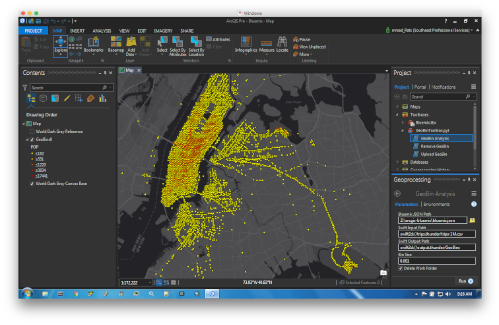
This is a proof of concept project to enable ArcGIS Pro to invoke a Spark based geo analytics on IBM Bluemix and view the result of the analysis as features in a map.

img-alternative-text

Check out the source code here

Wednesday, March 1, 2017

Space Time Ripples

Start by looking at this application and that one. Make sure to tilt the map by holding down the right mouse button and sliding the mouse up. Then, slide the bottom slider back and forth to see the data "ripple" through time.
img-alternative-text
This type of visualization is something I have wanted to do for a long time and is now possible with the advent of the new 4.2 ArcGIS API for JavaScript. The new API has "hooks" to enable a developer to invoke WebGL shaders directly, which can render a massive amount of data very efficiently and very quickly.
img-alternative-text
The authoring of the data for the above applications is based on ArcGIS Pro extended with a custom ArcPy based toolbox. The tool queries features from a user selected feature class, bins the features by space and time and emits a space-time "cube" in the form of a Dojo AMD module to be loaded by a JavaScript application. The source of the feature class can be a geodatabase, a relational data store, or the new SpatialTemporal BigData store.
Yes, I should have written a web service to do that, but this is my blog post and leaving that as an exercise for the reader :-)
I have to admit that I am a bit selfish in building the JavaScript application in "mixing" two languages: JavaScript and TypeScript. I wanted to try out the TypeScript extension to our JavaScript API, and I long for a type-safe language when building front end applications like in my olde Flex/AS3 days. It turned out that TypeScript is very cool, especially when used within IntelliJ :-)
Like usual, all the source code can be found here, and I will be talking about it more next week at my presentation at DevSummit. See some of you in Palm Springs.

Wednesday, May 25, 2016

Snapping Points To Lines And ArcGIS Pro

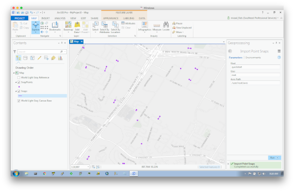
Been wanting to post on this subject for quite some time (actually over a year) as associating a world coordinate with the proper nearby linear feature provides tremendous insight based on the fusion of their attributes. Moreover, doing that on a massive scale and quickly is even more imperative in today's BigData world, thus the usage of Apache Spark. I’ve posted a standalone implementation that relies on well-documented simple math and published methodology to perform searches on massive datasets in batch mode. What is exciting to me in writing this post was the viewing of the snap results in ArcGIS Pro. My lack of knowledge in extending ArcGIS Pro with downloadable Python modules contributed to the delay (and slight case of procrastination :-). However, with the help of a colleague, I was able to pip install modules that can be imported by my custom ArcPy based toolboxes without any errors.

img-alternative-text

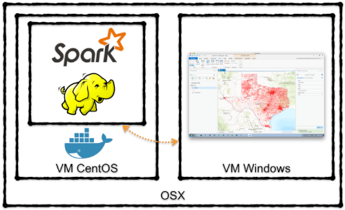
Also, since this is all based on BigData, well it has to be tested in a BigData environment. The post describes the usage of Docker and the Cloudera QuickStart container to check the snap and the visualization. The following illustrates my development environment.

img-alternative-text

Like usual, all the source code can be found here.

Sunday, April 10, 2016

Vector Tiles: The Third Wave

When it comes to web mapping, we are surfing on a third wave in our digital ocean. And the “collaborative processing” between the digital entities while surfing that wave is making the ride more fun, insightful and expressive.

The first web wave was back in the mid 1990s, where interactive maps in the form of html image tags relied heavily on the server and requests parameters to regenerate the image when you clicked on the edge arrows to pan and zoom. Remember MapQuest and ArcIMS ?

Then in the mid 2000s came the second wave or more like a tsunami, Google Maps. You hold down the right mouse button on the map and drag to pan, you use the scroll wheel to zoom in and out, and… when you click on the map, a bubble appears on the map showing the details of the clicked location. Disruptive ! And all was smooth, responsive and AJAXy. This is when I believe that this collaborative processing concept took root and materialized itself in the web mappers’ minds. Soon after, more expressiveness was required as HTML was lacking in power and functionalities and the capitalization on browser plugins emerged to create Single Page Applications. Remember Flex and Silverlight ?

We are now in the mid 2010s. Flash is dead because he ate an “Apple”. HTML5, CSS3 and Javascript are in full swing and though Tile Services are fast as the tile images are preprocessed and prepared to be displayed, they are still image based, and dynamic styling of the features in a tile is not easy. In addition, with the ubiquity of GPUs on edge devices, faster rendering for expressiveness is now possible through the elusive “collaborative processing”.

Enter Vector Tiles. Map box has defined a vector tile specification that we at Esri have adopted it in our Javascript API, and demonstrated its versatility at the 2015 User Conference. Andrew Turner has a nice writeup about it. And found this nice in-depth paper that analyses the dynamic rendering of vector-based maps with WebGL.

I wanted to know more about it and I learn by doing. So I implemented two projects, a Mapbox Vector Tile encoder and a visualizer as heuristic experiments to be used with the Esri Javascript API. Again, these are experiments and will report on more updates.

Tuesday, March 15, 2016

ArcGIS For Server On Docker

“But…It works on _my_ machine !!!” How many times did you hear that ? That is exactly one of the use cases of Docker for developers - Create an exact reproducible environment for each developer, even down to the hardware specification. And, that same environment can be on premise or in the cloud.
With the advent of ArcGIS For Server 10.4, I wanted to run it on my mac so I can try out some of the new features like chaining multiple SOIs.
I could have started a Windows based VM and gone through the GUI based setup, which is a pretty straight forward process (My friend Georges G. calls this, a PhD process, Push Here Dummy). But, I wanted to automate the whole install process in a headless way (I’m sure there is a way to do that using Windows, just I do not know how, maybe a blog post for another day)
Enter Docker. After downloading the ArcGIS For Linux tarball and the license file from my.esri.com, you can build a Dockerfile that automates the whole install process in a headless way - DevOps love this - In addition, once a build is done, you can run the image on premise or in the cloud by referencing a docker-machine.
Like usual, you can check out the whole source code on how you can do this here.

Monday, February 8, 2016

(Web)Mapping Elephants with Sparks

CSV files (though not the most efficient format and least expressive due to meager header metadata) is one of the most ubiquitous formats to place data in BigData stores like HDFS. In addition, geospatial information such as latitude and longitude is now the norm as fields in those CSV files origination from say a moving GPS based device.
A constant request that I receive all the time is “How do I visualize on the web all these data points?” There is a legitimate concern in this question which is “How do I visualize on the web millions and millions on points?”. Well the short answer is “You Don’t!” (actually, you can…but that is blog post for another day). Though you can download a couple of million points to a web client, after a while the transfer time will be prohibitive. However, if you process the data on the server and send down the aggregated information to be symbolized on the client, then things become more interesting.
A common aggregation processing is binning, where, imagine you have a virtual fishnet and you cast that fishnet on your point space. All the points that are in the same fishnet cell are collapsed together to be represented by that cell. What you return now are the cells and their associated aggregates.

This
project is a collection of Python tools using the ArcGIS System that retrieves CSV data with geospatial fields from HDFS and displays the aggregation in the form of hexagonal areas using ArcGIS online web maps and web apps. The processing is done in Python using Apache Spark.

The ArcGIS System is a sequential composition of:

  • Desktop with Python based GeoProcessing extensions for authoring.
  • Server with GeoProcessing endpoints for publishing.
  • Online with WebMaps and WebApps built using AppBuilder for presenting.

Like usual, all the source code is here.